fbpx
Get In Touch
1983 Marcus Ave, Unit 204, New Hyde Park NY 11042, New York,
hello@encyphers.com
Ph: +1 718 312 8022


Project Brief

Marimix, a renowned brand known for its delectable Crunch Baked Sweet & Salty snacks, partnered with ENCYPHERS, a leading eCommerce design and development agency, to revamp its online platform. Together, their goal was to enhance the user experience on Marimix’s website, marimix.com, and provide a seamless shopping journey for customers. This case study explores the collaborative efforts between Marimix and ENCYPHERS to overcome challenges and achieve remarkable results.

Task

Shopify Store Design and Development

  • Strategy

    eCommerce Strategy (Business, Functional, and Technical), Email Marketing, Marketing Strategy, Ongoing Website Management, Custom Integrations, Website Audit and Optimization Strategy

  • Design

    Website UX Design and Development

  • Client

    Marimix

  • Platform

    Shopify Plus

Integrations

Throughout the website revamp process, ENCYPHERS strategically integrated various apps to enhance functionality and improve the overall user experience. These integrations included tools for advanced filtering options on collection pages, streamlined checkout processes, and efficient customer review management. By leveraging these app integrations, Marimix's website was equipped with enhanced features to better serve its customers and drive conversions.

UI & UX

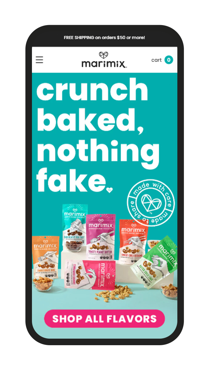
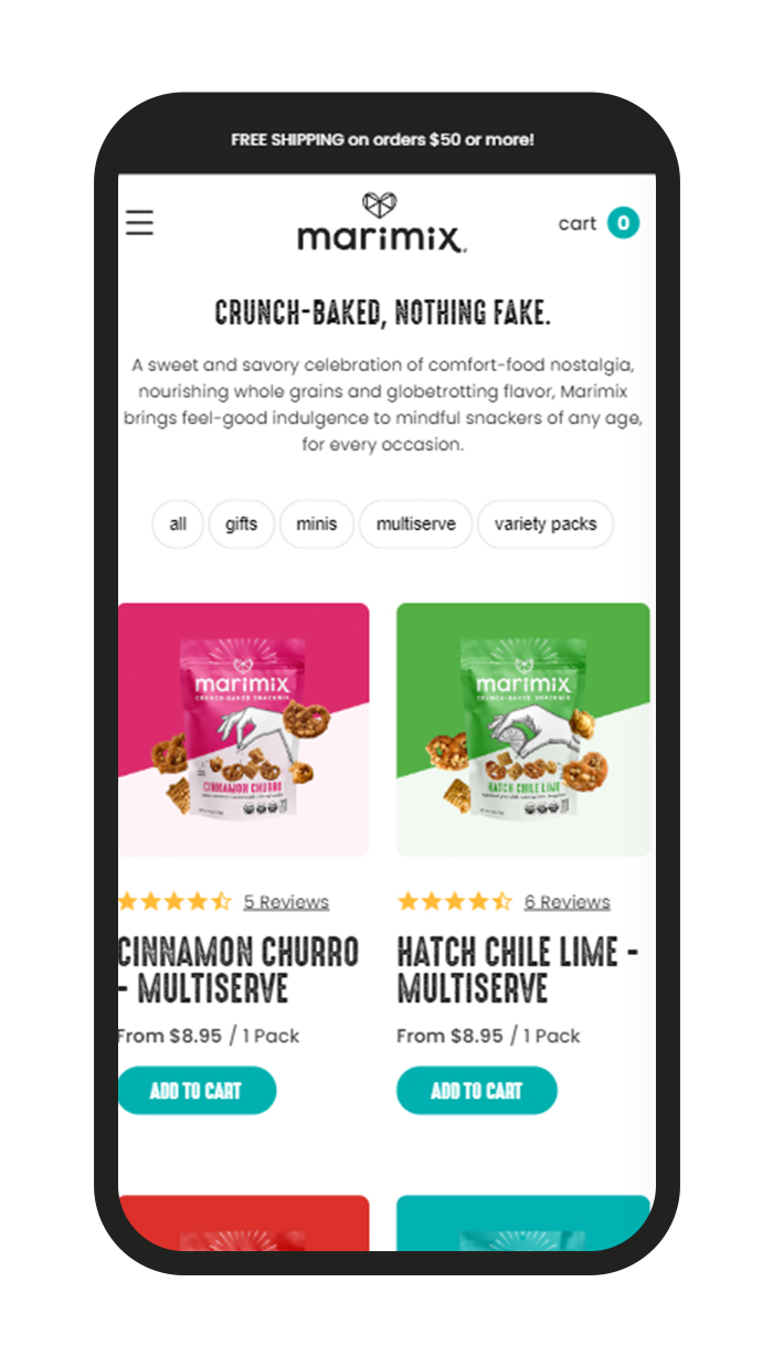
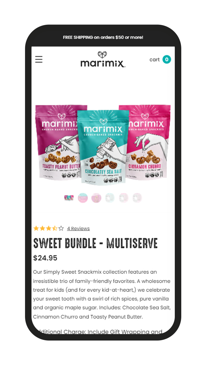
ENCYPHERS prioritized the enhancement of Marimix's user interface (UI) and user experience (UX) to ensure a seamless and engaging browsing journey for customers. The first step involved a thorough analysis of the existing website design and user flow to identify areas for improvement. This analysis encompassed aspects such as navigation clarity, visual appeal, content organization, and mobile responsiveness. Based on the findings, ENCYPHERS devised a comprehensive strategy to elevate the UI and UX of Marimix's website. The upgraded UI introduced visually captivating design elements that aligned with Marimix's brand identity and resonated with its target audience. This included the implementation of modern and cohesive color schemes, typography choices, and imagery to create a visually appealing aesthetic. Furthermore, ENCYPHERS optimized the layout and structure of key pages, such as the homepage, product pages, and checkout process, to enhance usability and facilitate intuitive navigation. By employing best practices in UI design, ENCYPHERS aimed to create a visually engaging interface that captivated users' attention and encouraged exploration. In addition to enhancing the visual appeal, ENCYPHERS focused on optimizing the UX to provide a seamless and intuitive browsing experience across devices. This involved implementing responsive design principles to ensure consistency and functionality across desktop, tablet, and mobile platforms. ENCYPHERS also paid close attention to interaction design, incorporating intuitive navigation elements, clear call-to-action buttons, and simplified forms to streamline the user journey. By prioritizing user-centric design principles, ENCYPHERS aimed to enhance user satisfaction, increase engagement, and drive conversions on Marimix's website.

Challanges

Challenge #001

Aesthetic and Layout Overhaul of Mega Menu

Marimix faced challenges with its existing mega menu, which lacked dynamism and user-friendliness, making navigation difficult for customers. The challenge was to develop a more dynamic and intuitive menu system capable of effectively showcasing Marimix's diverse range of snacks and guiding customers seamlessly.

SOLUTION

SOLUTION #001

ENCYPHERS initiated a comprehensive redesign of Marimix's mega menu, focusing on improving organization and visual appeal. The new mega menu featured clear categories and captivating visuals, offering customers a seamless browsing experience. With intuitive navigation and improved organization, customers could easily explore Marimix's product offerings, resulting in heightened engagement and increased sales.

Challanges

Challenge #002

Optimization and Functionality of Minis Collection

The launch of Marimix's minis collection presented the challenge of seamlessly integrating this new product line into the website. Marimix needed an attractive and user-friendly way to introduce these smaller, one-person portion-size packs to their customers.

SOLUTION

SOLUTION #002

ENCYPHERS created a dedicated section on marimix.com to showcase the Minis collection alongside existing options. This new section featured eye-catching visuals and effortless browsing options, enabling customers to discover and select the minis snacks with ease. By providing a dedicated space for the new offerings, ENCYPHERS effectively enhanced their visibility and sales, resulting in a significant increase in revenue within a short period.

Results

The collaboration between Marimix and ENCYPHERS resulted in a transformative upgrade to the brand's eCommerce platform. The mega menu upgrade and successful launch of the minis collection significantly improved navigation and product visibility, leading to a notable increase in sales and revenue. Furthermore, the enhanced collection and product pages, coupled with strategic app integrations, contributed to a more engaging and seamless shopping experience for customers. In summary, ENCYPHERS' web design and development services breathed new life into Marimix's online store, driving increased engagement, conversions, and customer satisfaction.
Back

Leave a Reply

Your email address will not be published. Required fields are marked *

18 + nineteen =